As an online business owner, you already know how important it is to put effort into driving conversions. So, you need to let your target audience know what you offer, why you’re the best choice for their needs, and how they can contact you right away. The best way to communicate this is through your website’s service pages.
A service page is like your online sales rep that guides your audience through the sales process and delivers them to a final purchase. The design of your service pages can have a huge impact on how many sales you make since this is where customers go to learn about your offerings and to understand the value that you can bring to them.
Here are some tips you can use to design high-quality service pages that communicate exactly what you offer and drive sales for your business.
Choose your service page imagery carefully
Exciting visuals are vital for grabbing your audience’s attention and demonstrating what your business is all about because they will help connect your audience to your services without requiring them to read through lots of content.
The right imagery can also help to increase your sales by establishing a connection with your audience. Choose images that reflect your brand messaging, the services you offer, and your target audience for the best results.
Let’s take a look at a company that does a great job of using images to humanize its products and services.
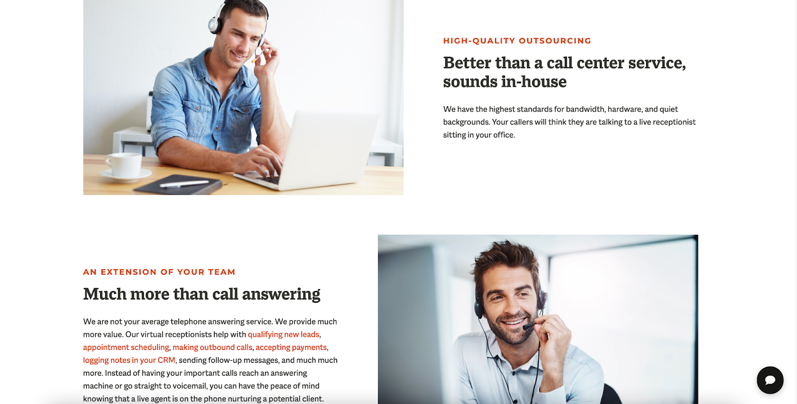
Let’s look at this example from Smith.ai, which offers a virtual receptionist service. The service page for the company’s 24/7 answering service uses high-quality imagery of real receptionists to help potential customers visualize what they can expect from the company. Notice how their visuals are bright, engaging, and show call service employees hard at work answering the phone for their customers. This helps to show potential customers that their calls will be answered by real people, which could be enough to convince a new client to invest.
You can implement the same tactic on your website by choosing imagery for your service page that puts a face to the products or services that you offer. Not only can the right images drive conversions, but they can also break up your page’s copy, allowing your readers to see for themselves the value your company brings to the table.
Convince customers with strong calls to action
Calls to action, or CTAs, are essential. However, many business owners make the mistake of not including strong, eye-catching CTAs on their service pages. The truth is they can be very powerful for generating sales because the right CTA can direct potential customers through the sales funnel.
A CTA is a phrase, typically displayed on a clickable button, that guides website visitors towards taking a specific action, like making a purchase or signing up for a service. They simplify the buyer’s journey and make it easy for visitors to see how to take the next steps with your company. Here are some ways you can integrate a solid call to action into the design of your service page:
- Ensure the CTA is displayed on a bright and bold button that stands out
- Be smart about the positioning on the page, so people are bound to see it
- Write a brief but strong instruction
- Keep the design around your CTA simple to avoid it getting lost in clutter
You may want to design multiple CTAs for different types of customers. Remember, not every user is going to be at the same stage of the buyer’s journey, so include various calls to action that speak to both customers researching possible services and ones who already know your company is the one for them.
Let’s look at a company that does a great job of adding CTAs to their page and header to help drive more qualified leads through the sales funnel.
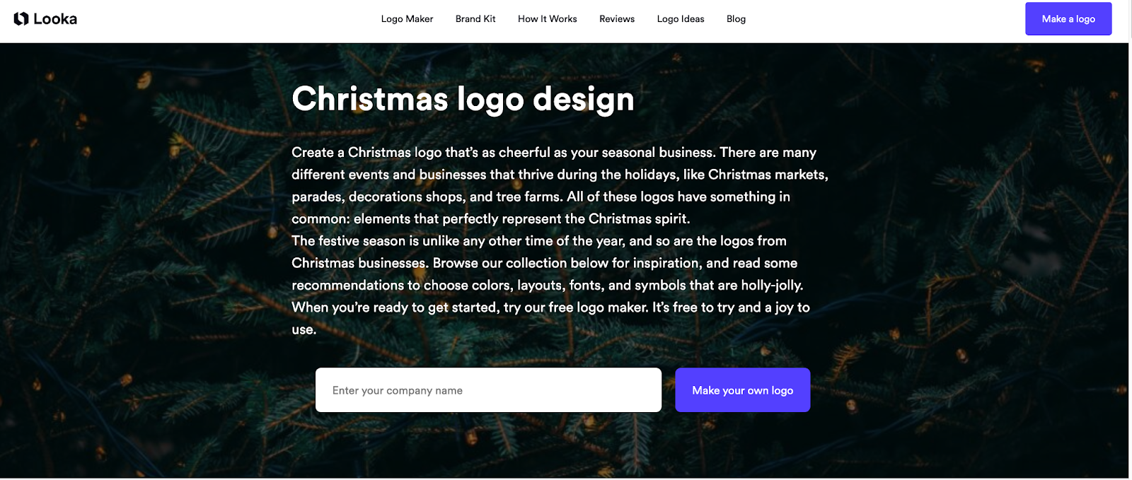
Looka, a logo design tool, uses a bright, eye-catching color for their CTAs and clear, direct language that lets the user know exactly what they can expect to happen once they click the button. This is a great strategy since the color helps the CTA to stand out from the dark background, and the clear messaging directs their readers to make a logo and engage with their company.
You can implement a similar tactic on your site by creating CTA buttons that stand out from the rest of your site and using clear language that directs customers on what steps they need to take next.
Dedicate a space to social proof of your abilities
You might know how exceptional your services are, but you’ll have a lot to prove to your potential customers. They’ll want to know they are making a sound purchase and can trust you to get the job done, and this is where social proof can help build trust with your customers and drive conversions across your site.
Social proof is a potent marketing tool that has the power to make believers out of potential clients. When designing your service pages, it’s essential to dedicate a section to showcasing what past customers thought of your performance, like:
- Customer reviews
- Long-form testimonials
- Case studies
Display a few pieces of social proof right on your service pages so customers can get a taste of your reputation. You can display three on a scrolling banner or highlight some weekly in your page header. You could also consider employing a review plug-in to help exhibit your social proof in an eye-catching way.
Let’s look at a company that does a great job of adding social proof to their service pages to help build confidence with their audience.
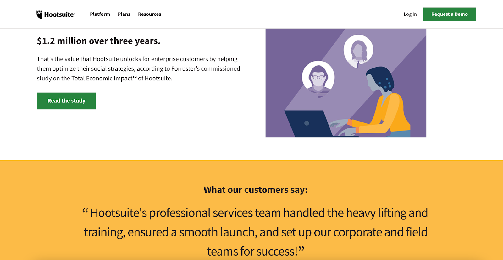
Here is an example of a service page from Hootsuite. This social media management service trains marketing directors on how to leverage social media to benefit their brand. Notice how they have chosen a glowing review to showcase on their service page to help the reader better understand what they have to offer. Their reviews also show potential customers that they can trust the services that Hootsuite offers since past customers have enjoyed their purchases.
Additionally, they offer a case study that goes into detail about how their services have helped a former client to earn a large amount of revenue in a short space of time. This goes a long way towards showing prospective customers that they have a lot to offer, and you can apply the same strategy to your website by adding long-form testimonials or reviews to your service pages.
Highlight your service’s USPs and benefits above the fold
To grab the attention of your potential customers, you need to highlight what your company has to offer without people having to scroll down your service landing pages. This is because most readers won’t consume all the content on your page, so you need to put the most important information at the top.
Your unique selling propositions, or USPs, are what set you apart from the competition. First, to identify what you should highlight, think about what qualities or features make your service unique.
At Loganix, a digital marketing agency, we offer Google Ads management as one of our services. Since we know our audience is looking for a solution that they can trust, we have distilled our USP down to one sentence that tells the reader exactly why we are the best choice for them. This punchy statement establishes trust with our audience by positioning us as experts they can trust for less than they expect to pay.
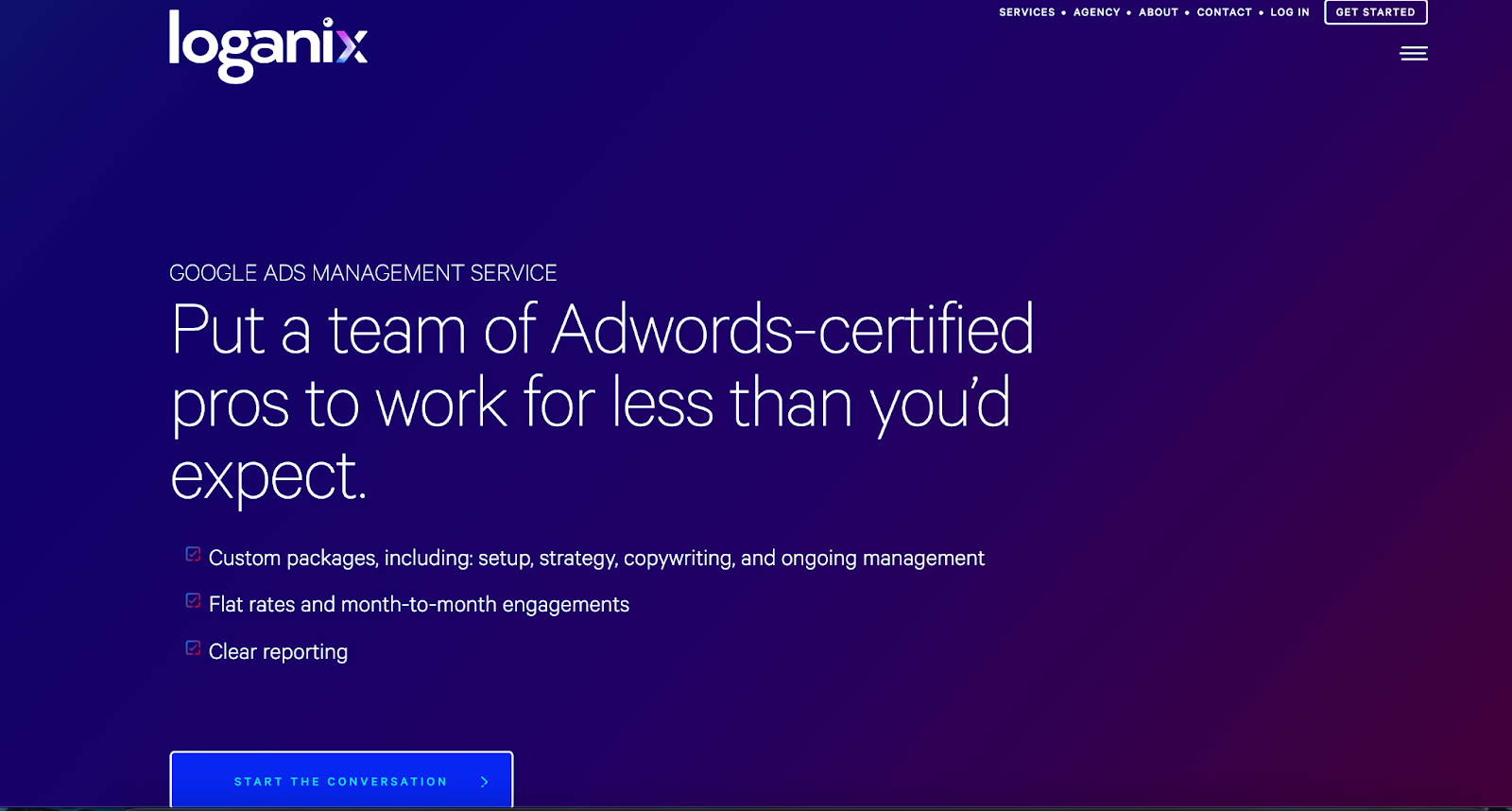
You can implement the same tactic in your online marketing strategy by communicating what you have to offer in a single sentence with strategic word choices to convey the correct message. Be sure to include specific benefits that you offer your customers based on what you think their primary objectives are throughout the sales process so you can show you understand their needs and are able to accommodate them.
Focus on ensuring your service pages offer a positive experience
Providing a positive user experience is the best way to convert a website visitor into a customer. This is because, if your service pages don’t provide a positive UX, virtual users won’t stay long enough to make a purchase.
So, you must take the steps necessary to ensure your service pages offer a fluid user experience that makes it easy for visitors to convert. Your service pages need to have:
- A fast loading speed so people can get the information they need without waiting too long for your site to load.
- An intuitive website navigation that helps to guide potential customers through your site in an orderly manner.
- Easy to read page copy that positions your company as the trusted source of the solutions your customers are looking for.
A positive user experience prevents users from growing frustrated when interacting with your site. The longer you can keep potential customers on your page, the more likely they will be to purchase.
Summary
Your service pages represent the heart of your business. Their job is to communicate the value of your services and convince customers to invest in what you have to offer.
So, to increase your sales, you’ll need to optimize the service pages of your site. Use these tips to design service pages that really sell and, before long, you’ll see your sales numbers skyrocket as your business grows to new heights.
Looking for more helpful information? Check out the Engine Templates blog for more great articles that can help you enhance your eCommerce business, increase web traffic, and drive sales.


