Layout Builder is a tool included to Helix Ultimate Framework that allows you to customize layout of your Joomla template in almost any shape without code customization.
1. Layout Grid
Helix Ultimate Layout includes a powerful mobile-first flexbox grid system for building layouts of all shapes and sizes.
You can choose columns pre-set or set your own grid if you want. The column will re-arrange depending on the screen size because the grid system is fully responsive.
You can use 2 built-in header variations that were added to enrich the scope and versatility of your Joomla websites.
Each Row can have its own column structure and unique settings.
You can change positions of rows by moving icon with arrows up or down.
Add new Row using plus icon (+), then choose column structure and select module position(s) used there.
As we said above, whenever you can also disable predefined headers and build your own custom title variations. Here are instructions for creating custom headers, Watch Video tutorial:
Follow the steps below:
Turn off Predefined Headers
Click on plus icon (+) under first row to create a new Row
Click gears icon
Add name: header inside “Section Title” field
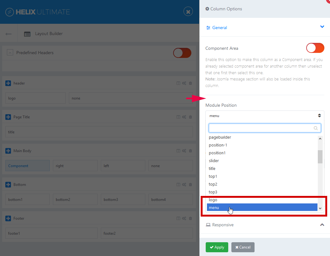
Click columns icon to set columns layout. Choose predefined headers or your own custom title variations. Less area reserved for logo column – means that presented logo would be smaller.
Save changes and set responsive grid for each column.
Note: Logo would be taken from Helix Basic settings, and Menu from Helix Mega Menu engine. And Sticky Header option can be used also for custom header.
You have choose different module position name if you want to use your own menu module, do not use “menu”.
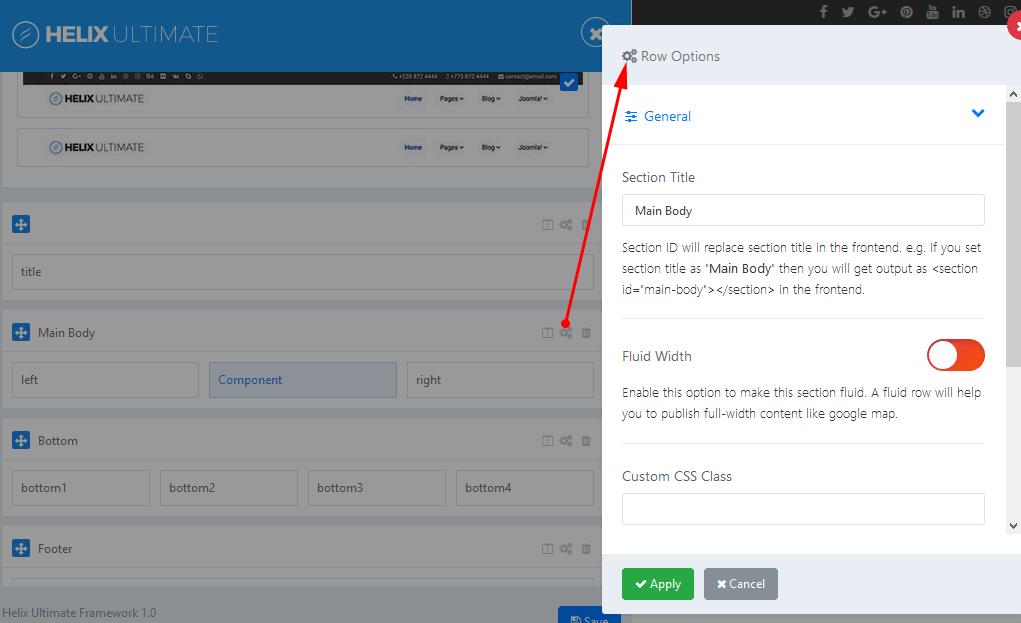
2. Row Options
What can we do in this section?
You can insert section title: Section ID will replace section title in the frontend.
Set Fluid Witdth: Enable this option to make this section fluid. A fluid row will help you to publish full-width content like google map.
Add Custom CSS Class Name
Define Row Style: margin, padding, text color, link color, link hover color, background color and choose background image.
Responsive settings – it allows you to hide Row on selected devices, related with screen resolution:
− Desktop – screen width equal to or greater than 1200px
− Smaller Desktop – screen width equal to or greater than 992px
− Tablet – screen width equal to or greater than 768px
− Largen Smartphone – screen width equal to or greater than 576px
− Smartphone – screen width less than 576px
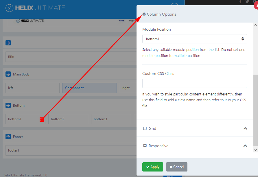
3. Columns Options
Make Component Area – Enable this option if you want this column to be as a Component area.
Module Position – You can select any suitable module position from the list of all available module positions below.
Above and below component area there are two module positions: content-top and content-bottom which can be used to publish there any module.
Custom CSS Class – If you wish to style particular content element differently, then use this field to add a class name and then refer to it in your CSS file.
Grid – it’s based on Bootstrap 4 grid system. It allows you to control of responsive layout, There are five grid breakpoints, one for each responsive breakpoint. Grid breakpoints are based on minimum width media queries.
Responsive settings – it allows you to hide Column on selected devices, related with screen resolution:
− Desktop – screen width equal to or greater than 1200px
− Smaller Desktop – screen width equal to or greater than 992px
− Tablet – screen width equal to or greater than 768px
− Largen Smartphone – screen width equal to or greater than 576px
− Smartphone – screen width less than 576px
If you have any question about this tutorial, don’t hesitate to leave a comment below. And don’t forget to share with your friends if you find it useful! Thanks! ?
We're a Digital Team from EngineTemplate with 5 content experts. Our team has 5 years exp in open source Joomla and WordPress, we make daily blogs and build useful resources for everyone who is having issues with open source while using it.
I love this template but I’m running into teething issues.
Is the ‘Travel Tips’ orange box in the Top 3 module position. I’ve put a menu there and can’t get it right. It stays in bullet list format regardless of what I do.
Also, I’ve tried to tp=1 on the demo page but it doesn’t work so I cant ‘see’ which is which in terms of module positions. Is there a guide somewhere?
Cheers
 ET Digital Team
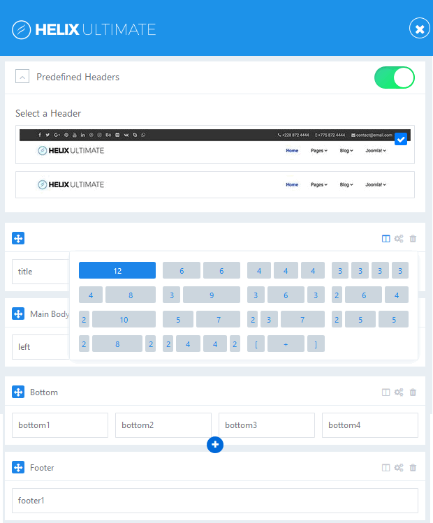


Great article. Thank you!
You’re welcome!
I love this template but I’m running into teething issues.
Is the ‘Travel Tips’ orange box in the Top 3 module position. I’ve put a menu there and can’t get it right. It stays in bullet list format regardless of what I do.
Also, I’ve tried to tp=1 on the demo page but it doesn’t work so I cant ‘see’ which is which in terms of module positions. Is there a guide somewhere?
Cheers
What template are you using?