The Helix Framework, particularly Helix Ultimate and Helix 2, is a popular choice among Joomla users for its flexibility and extensive customization options. One common requirement for web designers is to adjust the layout’s padding to create a more compact and visually appealing design. This guide will walk you through the steps to effectively reduce padding in Helix layouts, providing a technical yet user-friendly approach.
Understanding Padding in Web Design
Padding is the space between the content of an element and its border. It plays a vital role in web design by enhancing readability and ensuring that elements are not cramped together. However, excessive padding can lead to a disjointed layout, making the design feel unbalanced. Therefore, knowing how to adjust padding is essential for achieving a polished and professional look.
Why Adjust Padding?
- Visual Cohesion: Reducing padding can help unify elements on the page, providing a more cohesive appearance.
- Improved Readability: Too much space can distract users. A compact design can enhance focus on content.
- Responsive Design: Adjusting padding helps improve the layout on various devices, ensuring a consistent user experience.
Step-by-Step Guide to Reducing Padding in Helix Layouts
Step 1: Access Your Joomla Administrator Panel
Before making any adjustments, log in to your Joomla admin panel:
- Navigate to the Admin URL: Enter your admin URL in the web browser.
- Log In: Use your credentials to access the dashboard.
Step 2: Locate the Template Manager
- Go to Extensions: In the top menu, hover over “Extensions.”
- Select Templates > Styles: This takes you to the template manager where all installed templates are listed.
Step 3: Choose the Helix Template
- Select Helix Ultimate or Helix 2: Click on the Helix template you wish to modify. This opens the template settings page.
Step 4: Navigate to the Layout Settings

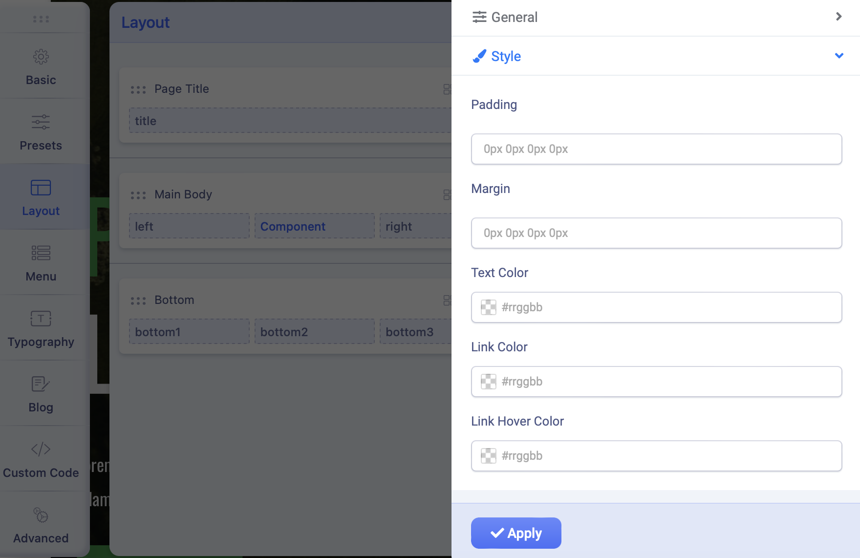
- Find the Layout Tab: In the template settings, locate the “Layout” tab. This section contains options for managing the layout of your site.
- Examine the Layout Structure: The layout is typically divided into various sections such as header, footer, and main content areas.
Step 5: Adjust Padding Values
To reduce padding effectively, locate the padding settings within each section:
- Identify Padding Settings: Look for options labeled “Padding” or “Margins” in the layout settings.
- Modify Values:
- Decrease Padding: If the default padding is set to
20px, consider reducing it to10pxor5px. This will bring elements closer together. - Uniform vs. Individual Adjustments: Decide whether you want to apply uniform padding across all sides or adjust each side (top, right, bottom, left) individually.
- Decrease Padding: If the default padding is set to
- Input New Values: Enter the new padding values in the designated fields.
- Save Changes: Always save your changes before moving on to the next steps.
Step 6: Utilizing Custom CSS for Fine-Tuning
If the built-in options do not provide the desired level of control, you can use custom CSS:
- Locate the Custom CSS Tab: In the Helix settings, find the section for adding custom CSS.
- Insert CSS Rules: Use the following template to adjust padding:
.your-section-class {
    padding: 5px !important; /* Adjust as needed */
}
Replace
.your-section-classwith the actual class name of the section you want to modify. The!importantdeclaration ensures your styles take precedence over existing ones. - Preview Your Changes: After adding custom CSS, refresh your website to see how the adjustments look in real-time.
Step 7: Use Browser Developer Tools for Live Testing
To refine your adjustments further, consider using browser developer tools:
- Open Developer Tools: Right-click on the element and select “Inspect” or use the keyboard shortcut (usually F12).
- Modify CSS Live: In the developer tools, you can change padding values in real-time to see how they affect the layout without making permanent changes.
- Copy Successful Styles: Once you find a padding setting that works, copy the CSS rules back into your custom CSS area in Helix.
Step 8: Ensure Responsive Design
When reducing padding, it’s crucial to maintain a responsive design:
- Check Default Responsive Settings: Helix usually provides responsive settings that adjust padding for different screen sizes.
- Add Media Queries if Necessary: If you need to make specific adjustments for mobile or tablet views, use media queries in your custom CSS:
@media (max-width: 768px) {
    .your-section-class {
        padding: 3px !important; /* Adjust for smaller screens */
    }
}
Step 9: Test Across Devices
After making adjustments, thoroughly test your website:
- Use Different Browsers: Check your site on multiple browsers (Chrome, Firefox, Safari) to ensure consistency.
- Test on Various Devices: Use mobile devices and tablets to see how the layout responds to different screen sizes.
Step 10: Troubleshooting Common Issues
While adjusting padding, you may encounter some common issues:
- Changes Not Reflecting: If your changes do not appear, clear your browser cache and any Joomla caching.
- Overlapping Content: If elements overlap after reducing padding, consider adjusting margins instead, as margins create space outside of elements.
- CSS Conflicts: Ensure there are no conflicting CSS rules. Use browser developer tools to identify and resolve conflicts.
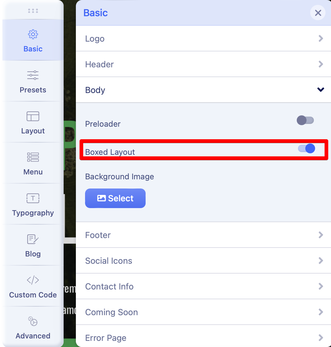
You also can use Boxed layout, so you will have smaller body size, see my screenshot

Conclusion
Reducing padding in Helix layouts is a straightforward process that can significantly enhance your website’s appearance and usability. By following the steps outlined in this guide, you can achieve a more compact design that improves coherence and readability. Remember to save your changes frequently, test across different devices, and utilize custom CSS for more precise adjustments. With practice, you’ll master the art of layout optimization in the Helix Framework, leading to a more refined and professional online presence.


